UX DESIGN INSTITUTE
Rethinking the mobile flight booking process
While people book thousands of flights every day and the customer journey has been extensively studied, there is still margin for improvement.
Airlines companies have dozens of user interactions, but just few drives them. One of the most important ones is the booking process. Here I'm creating an experience that speeds up the booking of a flight and removes ambiguities during the process (such as unclear pricing or hidden stopovers).
Research & analysis
The project started with a broad request of a new mobile airline app that improves the booking process without a specific indication or pre-existing insight. The flight booking flow has been extensively analyzed so there is no need to start from scratch. I decided to start my research finding out the main difficulties people are facing on major airline companies mobile apps and iterate from there.

Research phase
- Competitor analysis on two airline companies (KLM and Emirates), one budget airline company (EasyJet) and a flight aggregator (Skyscanner).
- Online survey in which 37 people participated.
- Led two usability tests with in-depth interviews and participated in two tests as a note taker.
Pain points
Fares
People often book flights without fully understanding what’s included in the "Basic" or "Smart" fare. This is due to two main reasons: difficulty finding the relevant information and the use of lengthy, text-heavy explanations without visual aids like infographics.
Price
People had to go through the whole process before knowing if the price was referring to the total amount or to the amount for one person.
Stopover
Often people discovered only at the end of the booking or at the seat selection step if the selected flight has stopovers or transfers to a different airport in the same city.
Extra Luggage
- The extra luggage option is not always present. Users wondered if, when and at what price it is possible to add luggage.
- When the option is present, still it is not always clear what is already included in the selected fare, so they cannot make the best choice.
Seat Selection
Repetitive task and unclear why one seats is more expensive than another. Price legend is often hidden.
"They never showed there was a stopover. I will not continue with the booking."
Analysis phase
Together with two colleagues we gathered the information from the research phase: competitive analysis, survey, interviews and usability testing. We wrote each point on a post-it, then we grouped them in categories, creating an affinity diagram.
We proceeded organizing the results in a customer journey map in which we pointed out the user's feeling for each step together with goals, behaviour, pain points and mental model.

Design
User flow
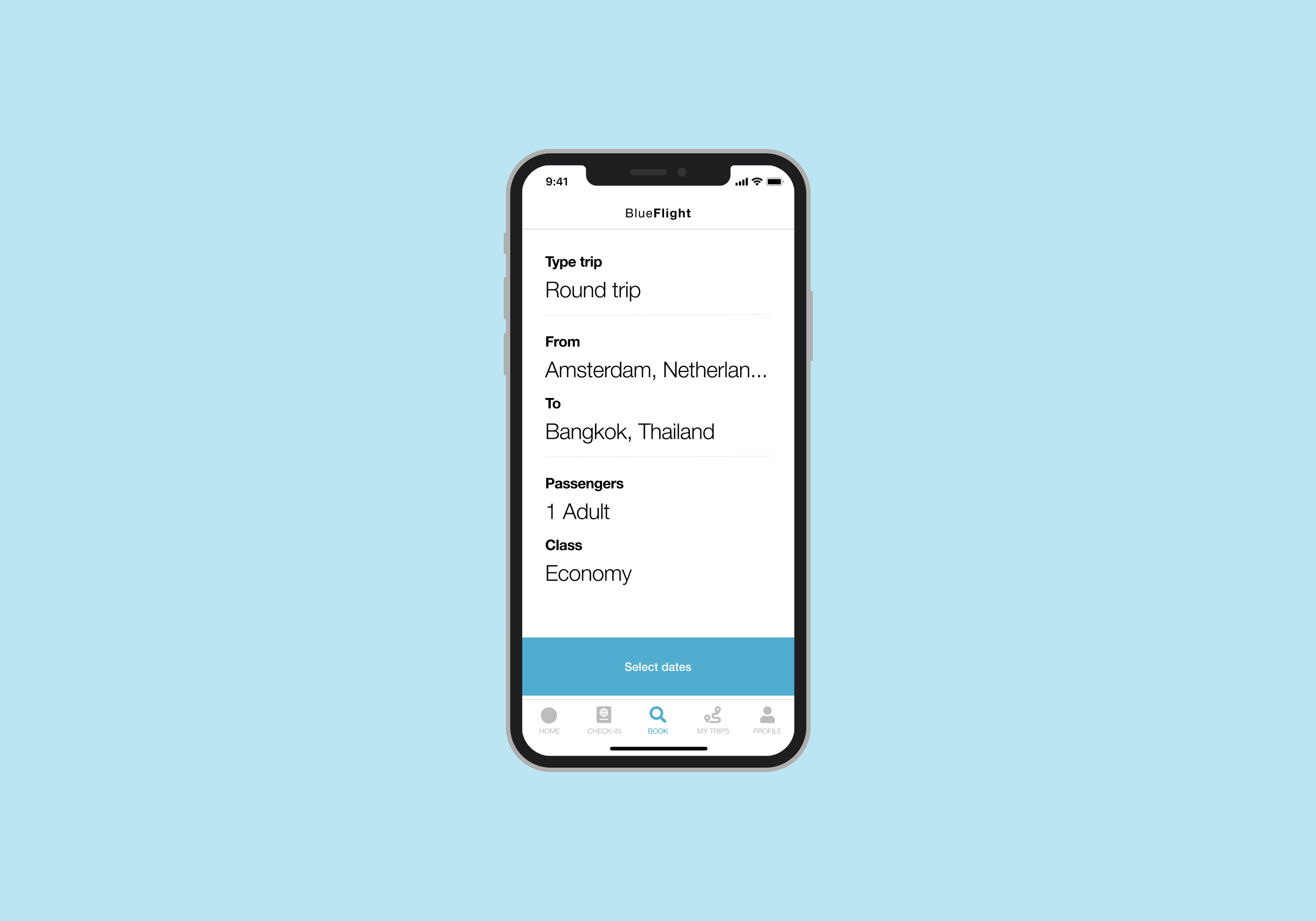
I made a high-level flow that represented my primary use case. This formed the basis for my design. I started addressing the pain points found during the research phase. Mobile flight booking experiences tends to be sequential, that is why I decided to present it in a linear way.


Sketches
Quick sketches have been made to have a first overview and facilitate discussions with stakeholders, which led to more iteration. I was able to understand the user interactions, including which information and keyboards were needed in each step. This helped me to define the flight booking process in more detail.
Design focus
Existing booking processes are designed to arrive as quickly as possible to the final payment step. Airline companies have to increase the conversion of people booking flights. However, to achieve their goal, they often make the process less clear, which generates frustration in the users and decrease in loyalty.
I decided to focus my design decisions on bringing back clarity to the process while keeping it fast.
4 Main focus
A pleasant journey: keep the status of the flow always visible
Stopovers: no more surprises
Extra options: keep costs clear and easy to skip
Removing ambiguities: let the users know what they are buying
A pleasant journey: keep the status of the flow always visible
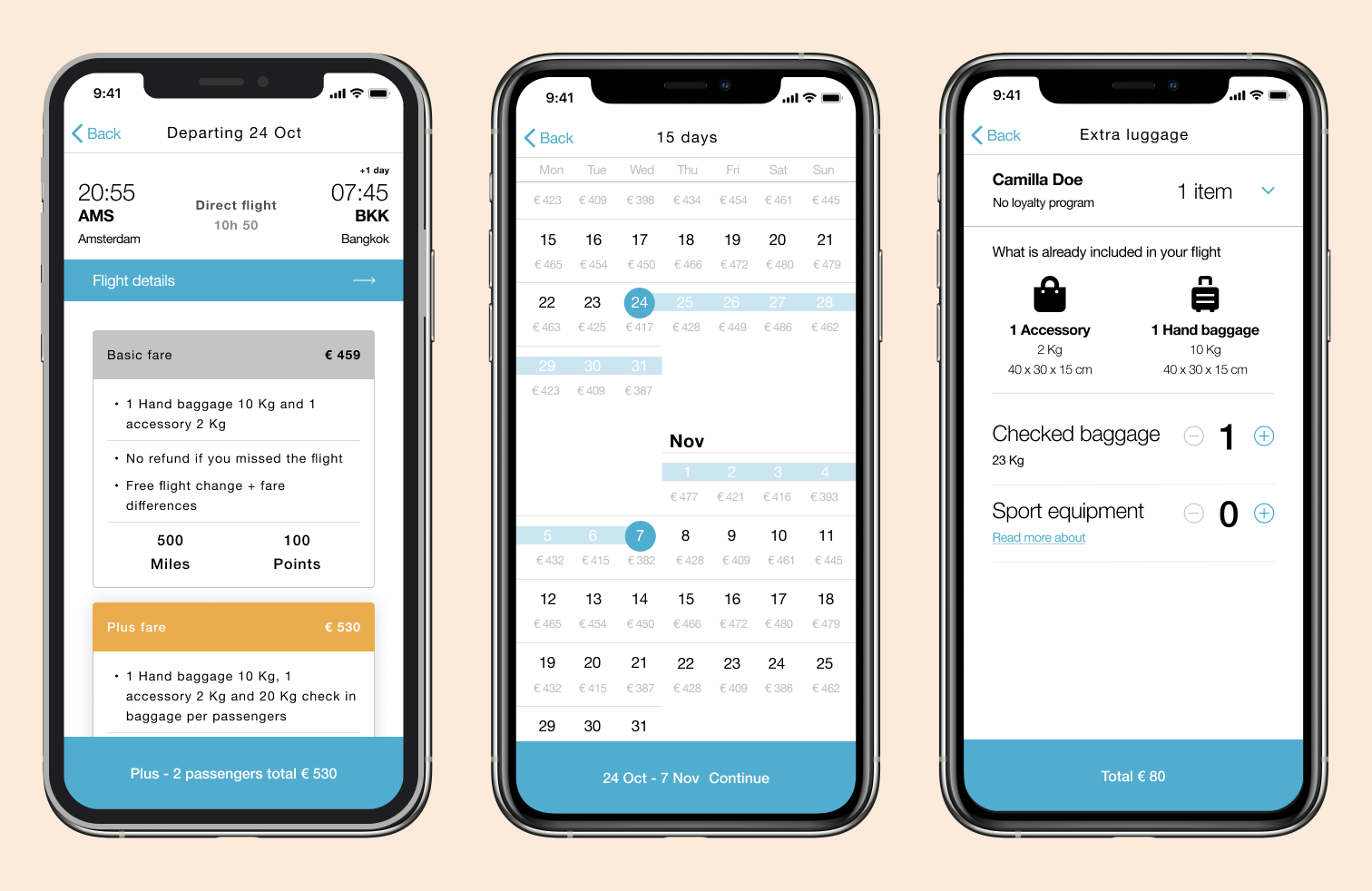
Especially on mobile devices, due to the screen size, people could feel lost not knowing where they are in the process and what they have selected previously, leading them to go back and forth through the navigation stack of the app. I decided to implement a simple but very useful idea: I use the navigation bar and the main "Continue" button to show the users where they are in the booking flow together with the status.
In the image below you can find a few examples of how I applied this concept. For example, the date picker shows on top the amount of trip days and at the bottom the selected dates. This is even more useful if we take into consideration the smaller phones screen and possible long travel (1 month or more), the user doesn't have to scroll up and down the screen to double check which the selected dates or to count the number of days. The important information is always visible for the user.
Flight check before payment
Stopovers: no more surprises
From the research phase, it was clear that people get really frustrated, till the point they are willing to leave the app or website, if they unexpectedly find out important information that was not well communicated. Information about stop overs and airport transfers should never be hidden in the hope to sell a ticket. These should always be communicated in a transparent way, building a trustful relationship with our users.
First of all I decided to create a clear separation on the search results list, creating sub-headers "Direct flights" and "Stop over flights". Secondly, when a flight is selected together with the Fare, the "Continue" button is turning active only after the user has scrolled the flight summary where they can find all the information about stop overs and airport transfers.
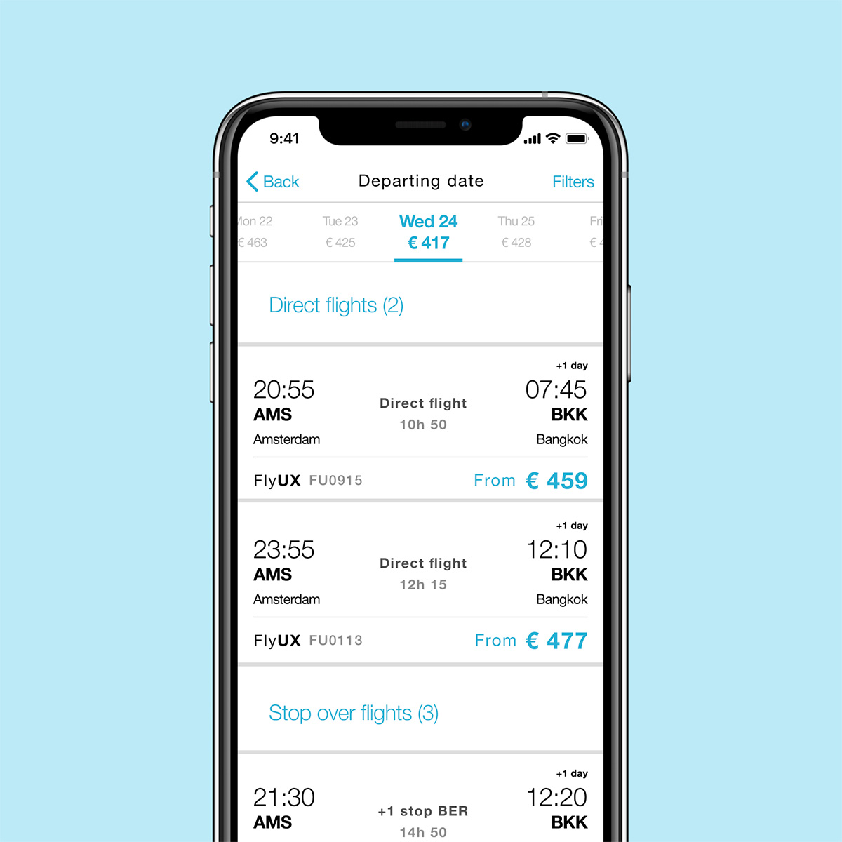
Selecting flight
Flight summary
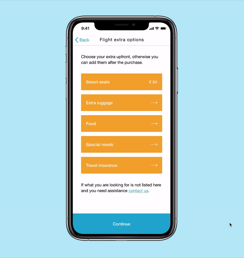
Extra options: keep costs clear and easy to skip
I kept the list of extras minimal, providing a clear explanation that additional options can also be added later, after the purchase. A "Continue" button is always available to skip this step. If any extras are added, the price will be displayed to help track the expenses.
For instance, in the "Extra Luggage" step, we display the luggage included with each passenger's fare, using intuitive icons for quick understanding. On every screen, you can easily find the relevant prices: the cost of a single flight, the price for each route (departure and return), and the breakdown of prices for any added extras.
Selecting extra luggage
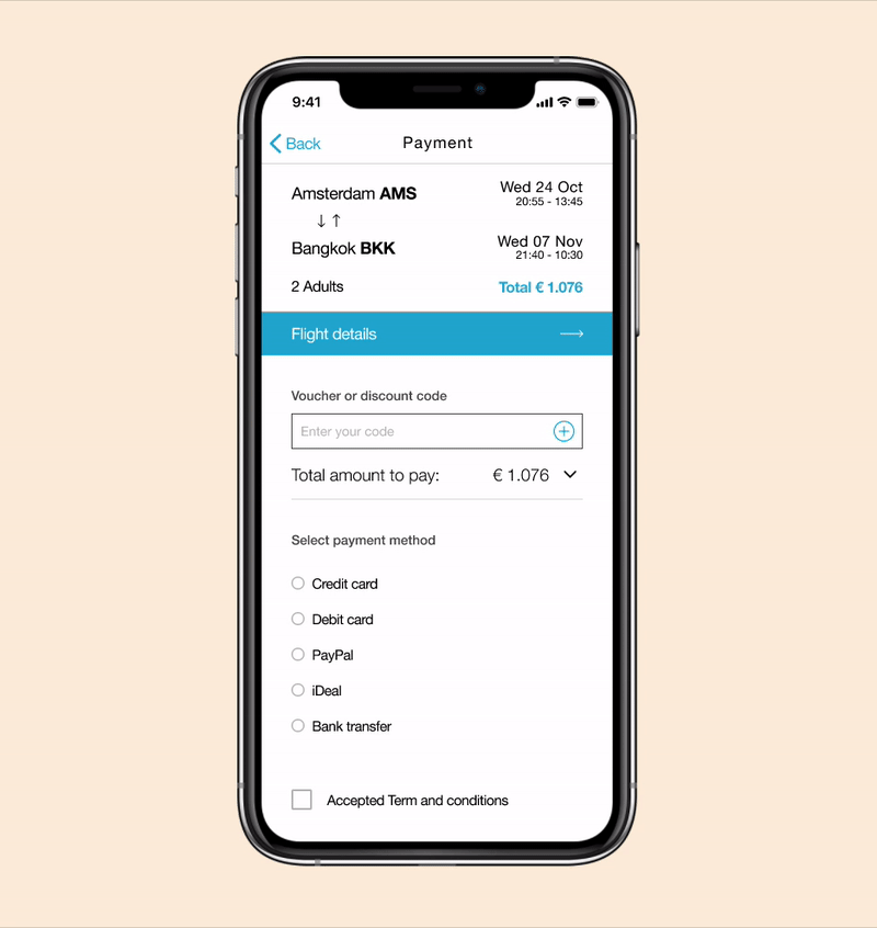
Removing ambiguities: let the users know what they are buying
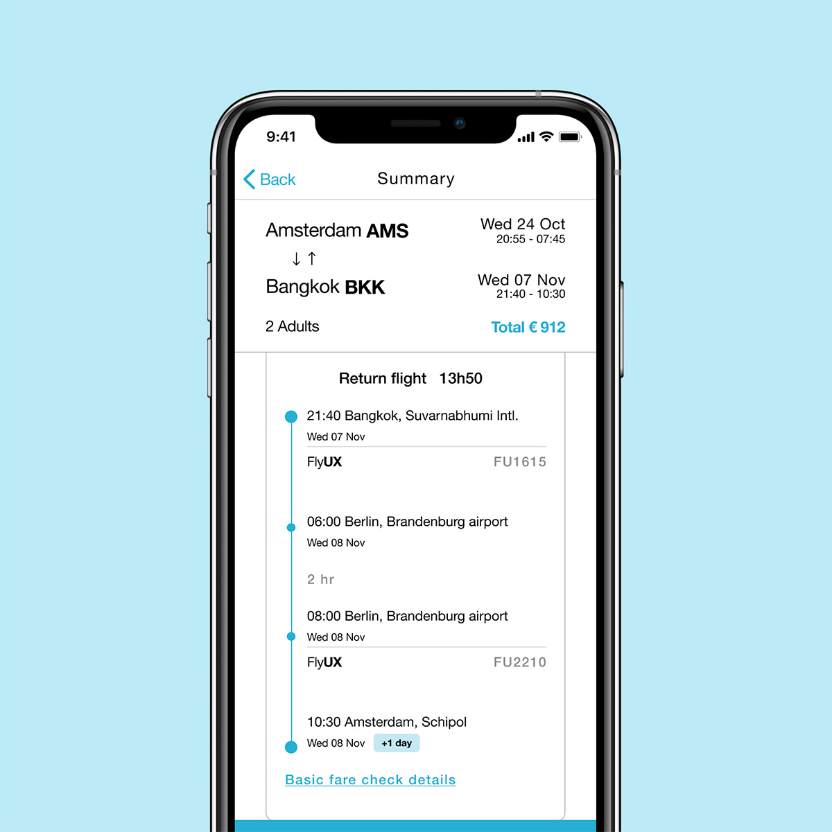
At the payment step, we make it easy for users to understand the breakdown of the total price and what they are purchasing.
First, we clearly indicate that the price covers both passengers, with a transparent breakdown showing how the total is divided between the flight, taxes, and any extras. Second, by clicking the "Flight Details" button, users can quickly view all the flight and fare details in one place, without the need to navigate back and forth.
Flight check before payment
Prototype and documentation
After designing each screen in medium fidelity I created a prototype. The prototype has been validated with users, bringing improvements during each iteration.
Together with the prototype I wrote the related hand-off documentation, click here to view.
For a better experience click the full screen icons (two arrows) on the top right and use the mouse to browse the prototype.